

こんにちは、パルシィ部のwcaokazeです。講談社とピクシブが共同で企画・運営・開発に取り組むマンガアプリ、パルシィ(Palcy)の開発をしています。
Android15以降Edge-to-Edge対応が必須となり、世のAndroidエンジニア達はEdge-to-Edge対応に追われていることかと存じます。
私共パルシィ部も暇を見つけてはEdge-to-Edge対応を進める日々です。
今回はパルシィ部がEdge-to-Edge対応のために取り組んだことをご紹介したいと思います。
Edge-to-Edgeとは?
機種や設定にもよりますが、たいていスマートフォンの画面上部には時計や充電残量などが表示されていて、画面下部には戻るボタンなどが並んでいるナビゲーションバーと呼ばれる領域があります。
通常、アプリがこれらの領域を使用することはありませんが、Edge-to-Edgeと呼ばれるモードを有効化することで、普段は時計などが表示されている領域までアプリが使用することができるようになります。
Edge-to-Edgeとの出会い
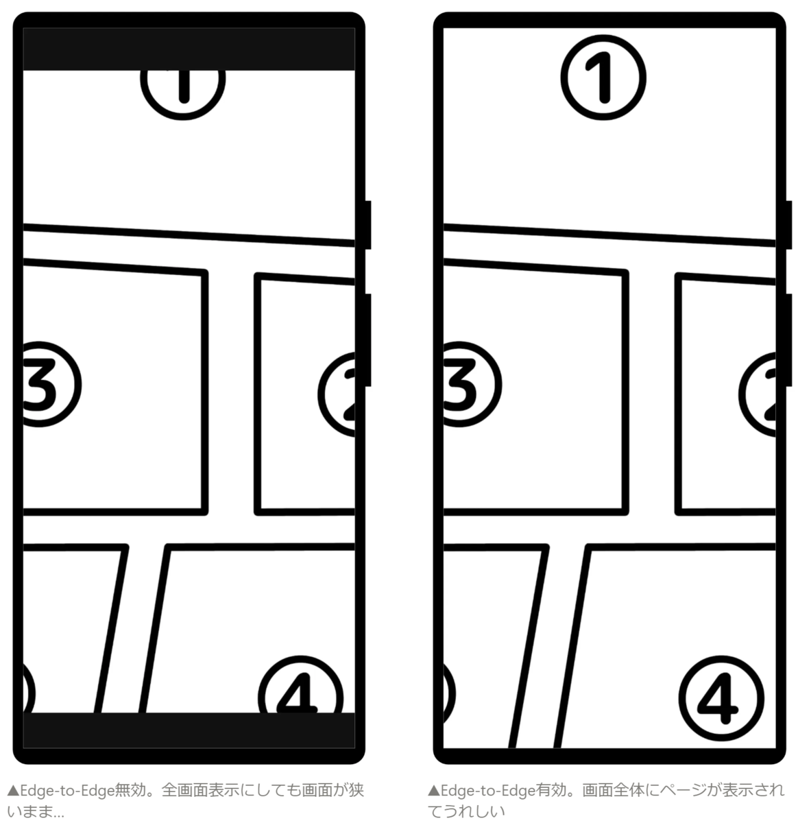
パルシィではマンガビューアの体験を向上させるためにEdge-to-Edgeを導入しました。
マンガビューアでは時計などが隠れ、全画面表示に切り替わりますが、Edge-to-Edgeが無効ではその領域にマンガページを表示できません。
Edge-to-Edgeを有効にすれば真の全画面表示を実現できます。
パルシィのビューアにはこれ以外にもたくさんのこだわりが詰まっています。 5分にまとめたスライドがございますので、こちらもぜひお楽しみください。 inside.pixiv.blog
これでマンガビューアの体験がよくなりました。めでたしめでたし。という単純な話で済めばよかったのですが、Edge-to-Edgeを有効化したことで大きな問題が発生し始めます。
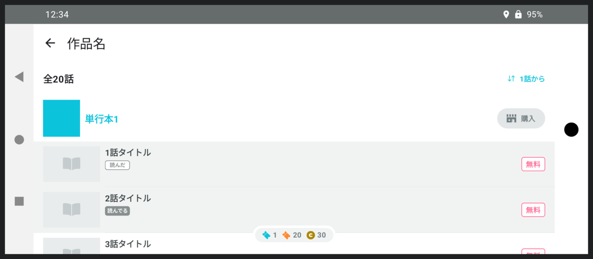
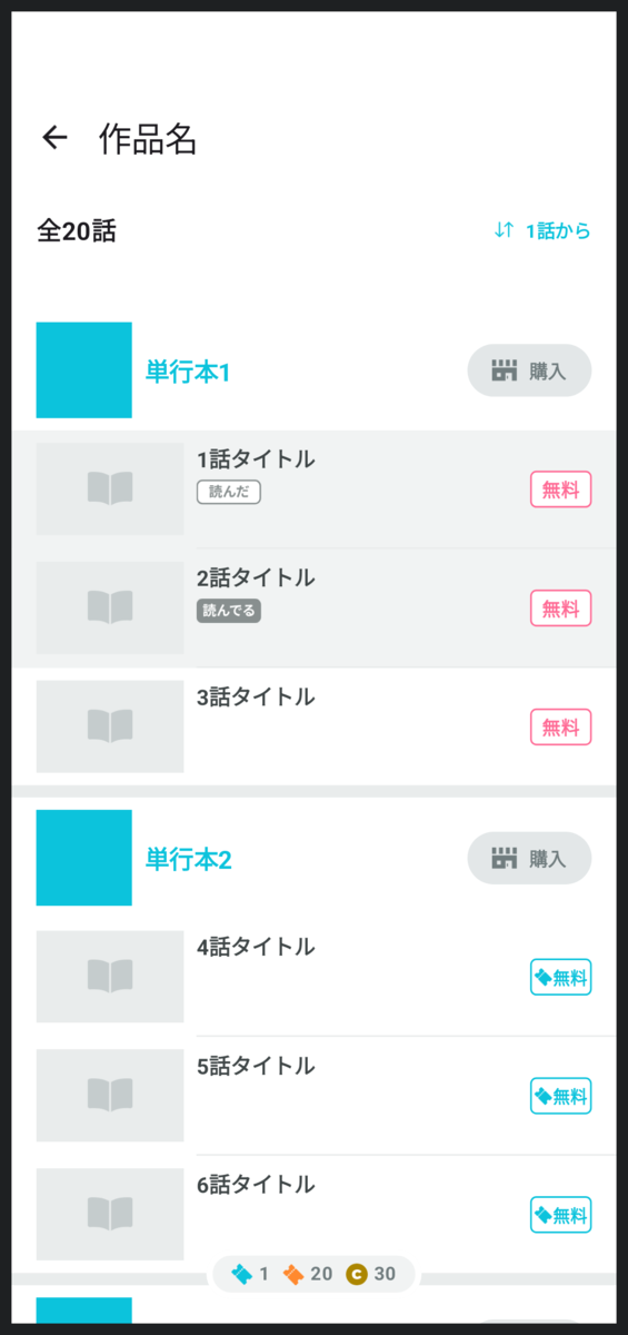
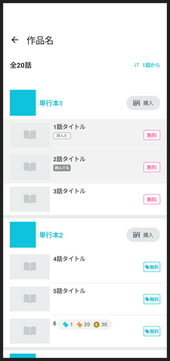
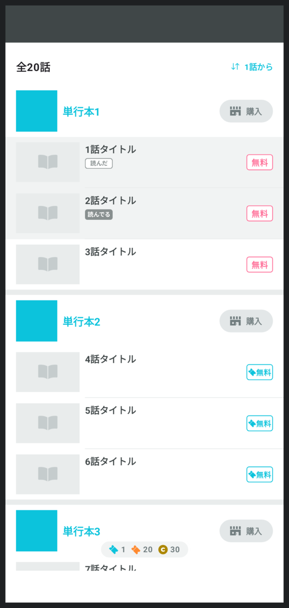
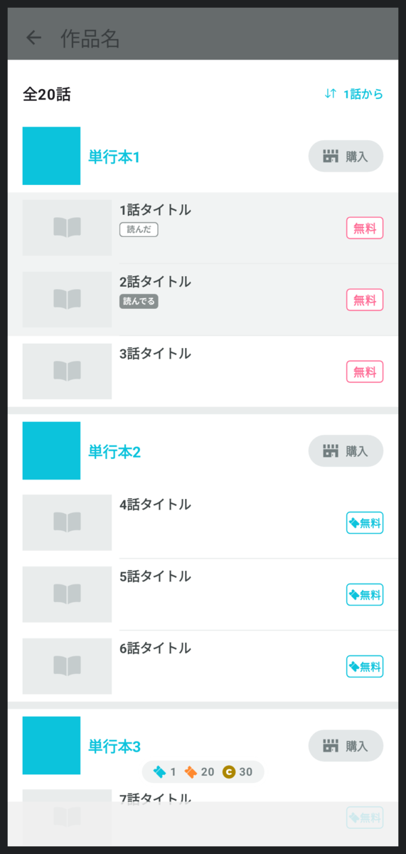
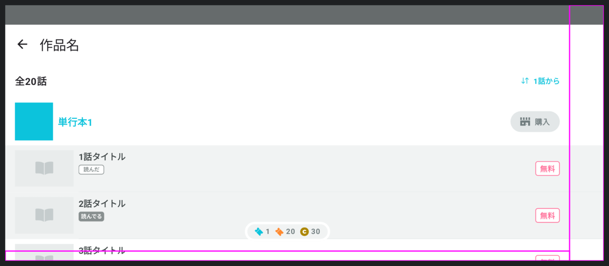
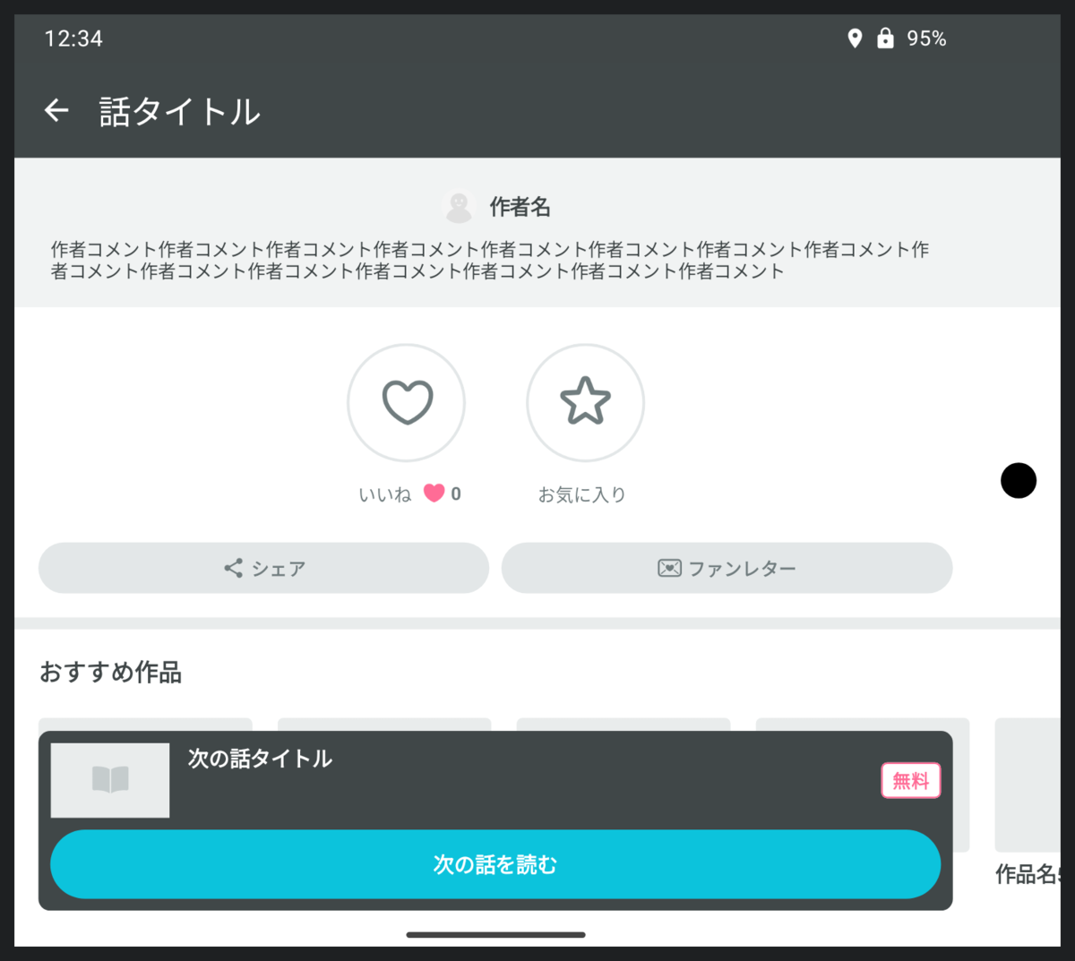
マンガビューア以外の画面、例えば話一覧の画面を見てみましょう。
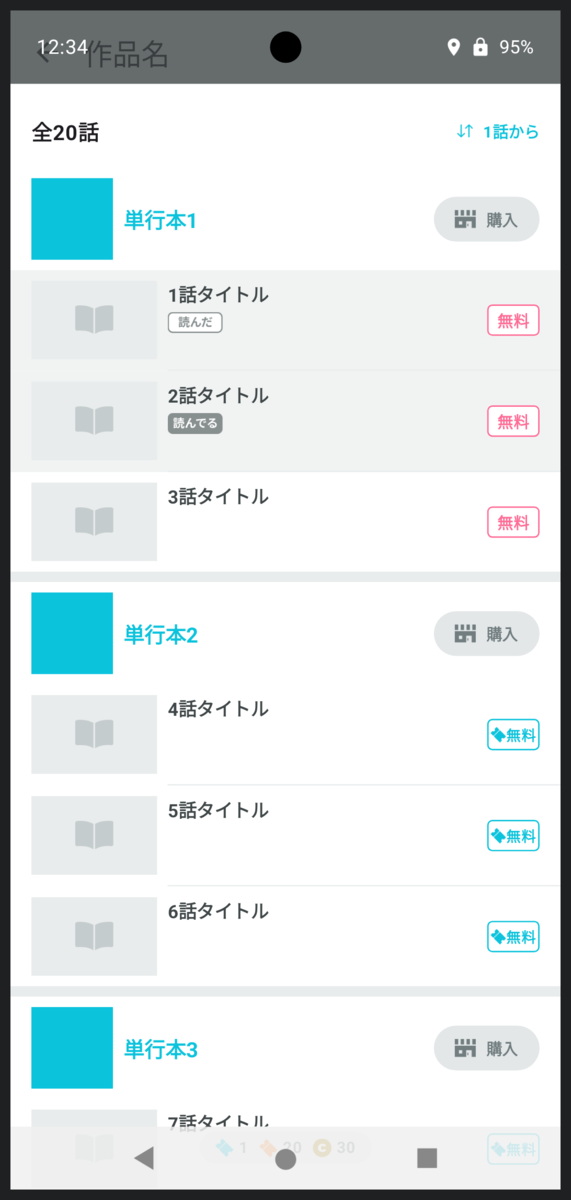
アプリの領域が広がった影響でヘッダーの作品名が表示される部分と時計が重なってしまいました。少しわかりにくいですが画面下部のナビゲーションバー部分も表示が重なっています。
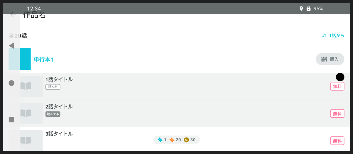
スマホを横持ちにするとこうなります。ナビゲーションバーもインカメラもアプリと重なっています。これはよくないですね。
WindowInsets
この問題に立ち向かうため、AndroidにはWindowInsetsという概念が用意されています。
画面の四隅にある時計やナビゲーションバーがどれくらいの大きさなのか教えてくれます。
機種によっては画面上にインカメラがありますし、文章を入力中の場合はキーボードが出てきてアプリの領域を圧迫するかもしれません。WindowInsetsはこういったものも同じ仕組みで扱えます。
先ほどのスクリーンショットを例に考えます。画面上部に時計があります。ですので、WindowInsets.statusBarは(left = 0dp, top = 32dp, right = 0dp, bottom = 0dp)のような値になっていることでしょう。
画面左側にはナビゲーションバーがあります。WindowInsets.navigationBarは(left = 48dp, top = 0dp, right = 0dp, bottom = 0dp)のような値になっていそうです。
Edge-to-Edgeが有効な世界では、我々はWindowInsetsの値を元にアプリのUIに適切な余白を設定しなければなりません。
余白をつける
先ほどの画面にWindowInsets分の余白をつけるとこのようになります。
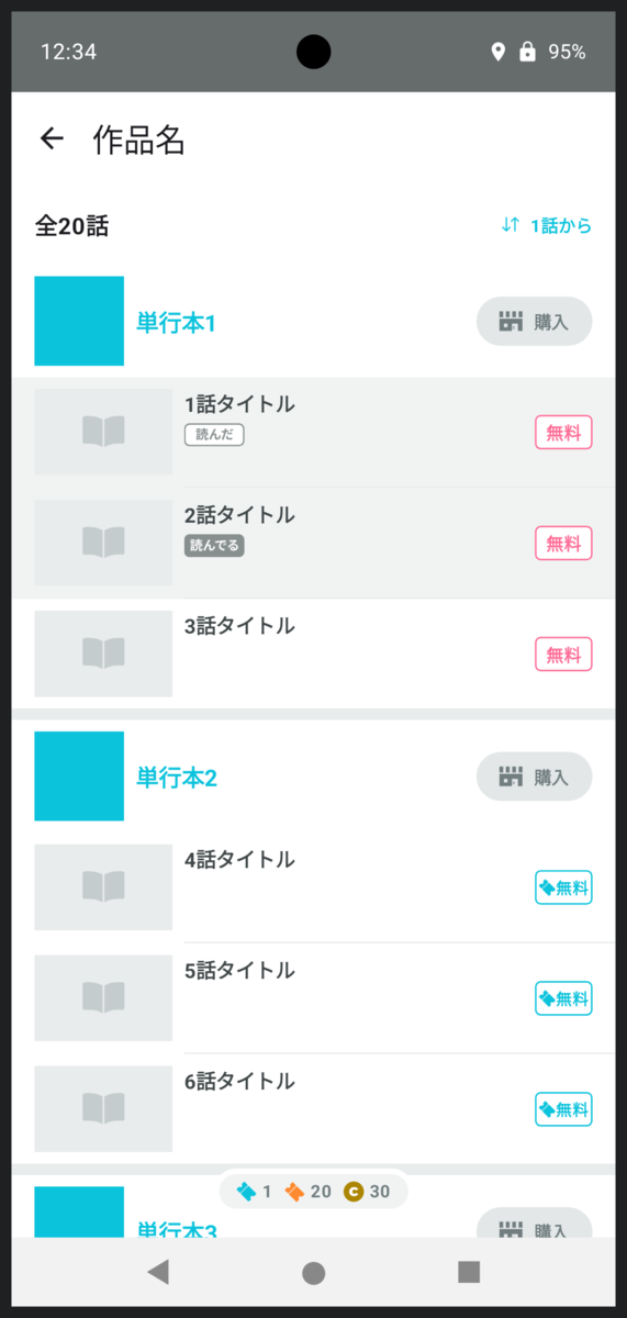
横持ちはこんな感じです。
Material Design3のJetpack Compose用のライブラリでも自動的にこのような余白がつくようにデフォルトのWindowInsetsが適用されています。
この状態を目指すとよさそうですね。
…本当にこれでいいのでしょうか?
私wcaokazeは疑問に思いました。これではEdge-to-Edgeを無効にしているときと何も変わりません。Edge-to-Edgeが有効になったことで使えるようになった領域は使うべきなのではないでしょうか…と。
では、新たに使えるようになった画面端の領域には何を表示するとよいでしょう? 逐一デザイナーと相談してもいいのですが、ほとんどの場合はわざわざデザイナーの貴重な時間を奪うまでもなく明らかです。
画面端に配置されているUIパーツについて、時計等のWindowInsetsと重なってもよいか重なってはいけないかを考えます。
例えば、画面の上端には作品名が表示されています。これはWindowInsetsと重なってはいけません。
画面の左端には「全20話」や話のサムネイルがあります。これもWindowInsetsと重なってはいけません。
右端にはソートボタン、購入ボタン、話の価格が並んでいますね。これもWindowInsetsと重なってはいけません。
なんだ、結局全部重なってはいけないんじゃないか。と思うのは早計です。画面端のUIはそれだけではありません。
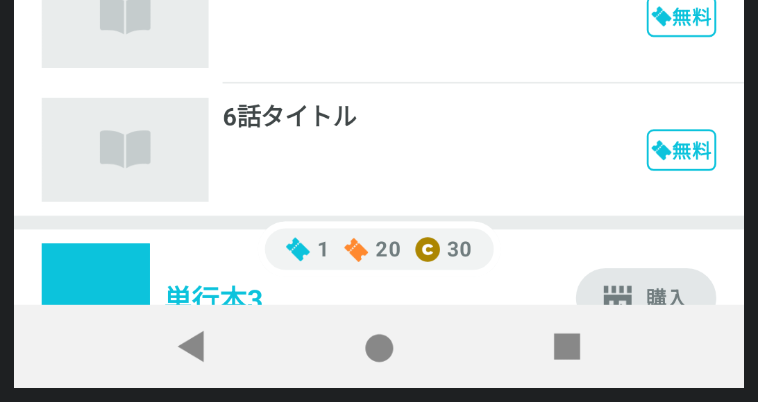
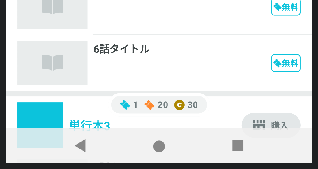
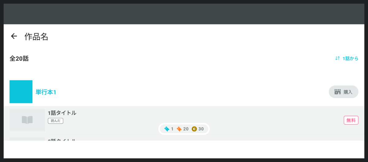
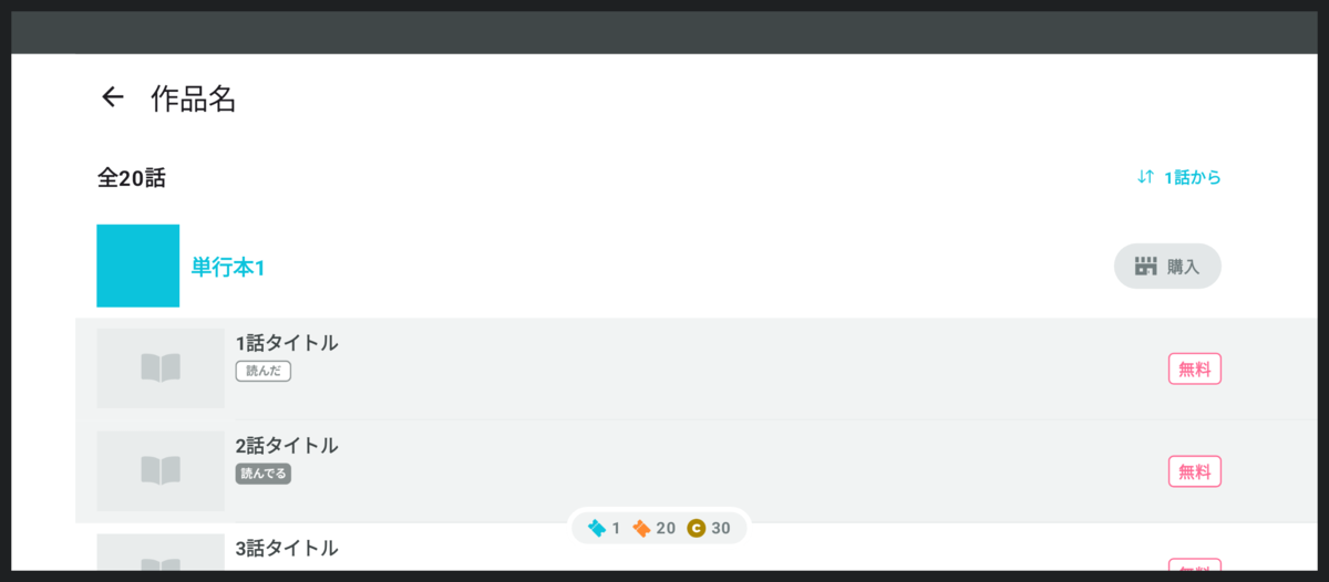
パターン1: 背景色
例えば読んだことがある話の項目は背景色が灰色に変わっています。この「背景色」もまた画面の左端と右端に配置されたUIなのです。
そしてこの背景色についてはWindowInsetsと重なっても問題ありません。
背景色を画面端まで伸ばしてみましょう。
実際に画面上に表示される情報の量は一文字たりとも増えていませんが、アプリが広くなったように感じられます。
コードはこんな感じになります。
@Composable
fun Episode(
    episode: Episode,
    windowInsets: WindowInsets
) {
    Row(
        modifier = Modifier
            .fillMaxWidth()
            .then(
                if (episode.isReadCompleted) {
                    Modifier.background(readCompletedColor)
                } else {
                    Modifier
                }
            )
            .windowInsetsPadding(windowInsets)
    ) {
        ...
    }
}
背景色をつけたあとにWindowInsets分の余白をつけていますね。
こうすることによって背景色だけが画面端まで伸び、サムネイルや無料アイコン等はWindowInsetsを避けられます。
パターン2: 中央揃え
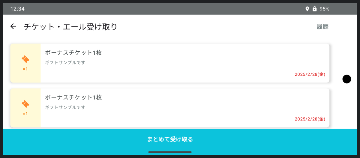
画面の下端はどうでしょうか?
チケットの枚数表示がありますね。
これはWindowInsetsと重なってはいけませんので、画面下部のWindowInsetsを避けるための余白だけつけておけばよさそうです。
…と油断してはいけません。
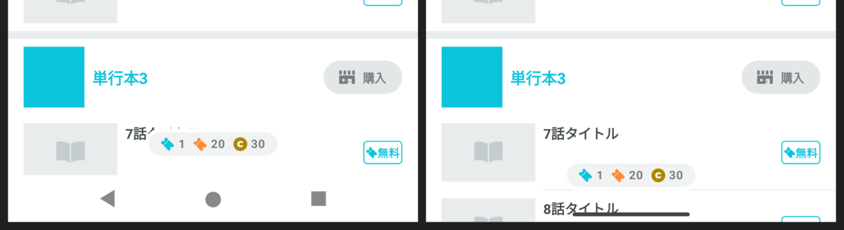
デバイスの状況によっては左右の片方にのみWindowInsetsがつくパターンもありえます。その場合にどうなるか見てみましょう。

画面の右端にWindowInsetsがつくパターンです。
購入ボタン等はWindowInsetsを避けて少し左に寄っていますが、件のチケット枚数の表示は左に寄っていません。ナビゲーションバーの○ボタンの位置と比べるとわかりやすいでしょうか。
どうしてこうなるのでしょう? 理由は単純で、WindowInsetsを考慮していないときの画面幅を基準にして中央揃え処理を行っているからです。
修正方法も単純。左右のWindowInsets分の余白を適用したあとに中央揃えにすればいいのですね。
AvailableTicketCountInformation(
    modifier = Modifier
        .windowInsetsPadding(
            windowInsets.only(WindowInsetsSides.Horizontal + WindowInsetsSides.Botttom)
        )
        .align(Alignment.BottomCenter)
)
パターン3: スクロール可能UI
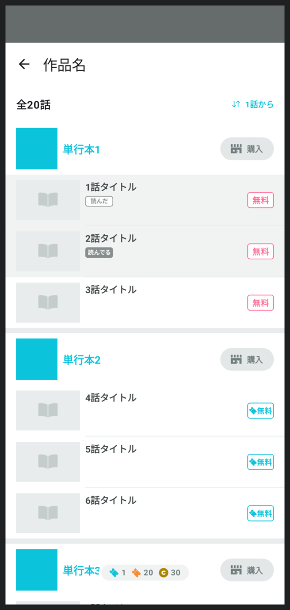
さて、画面下端にあるUIはチケット枚数だけではありませんよ。
話の一覧も下端まで表示されています。これはWindowInsetsと重ねることができます。
ただし、一覧についてはスクロールが可能です。一番下までスクロールしたときにWindowInsetsと重なったままだと困ります。
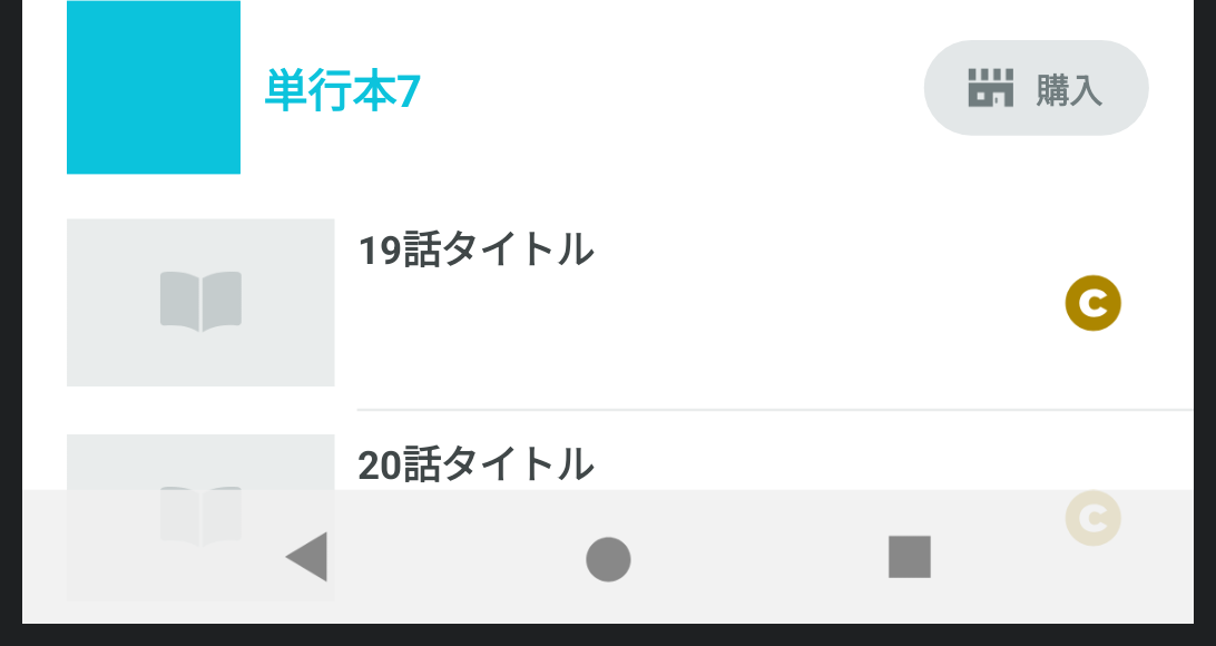
この作品は20話が最新話ですが、20話の情報が半分見えていません。
したがって、スクロールが可能なUIについてはWindowInsetsと重ならない位置までスクロールを可能にする対応が必要です。
大抵の場合、これは「スクロール可能なパーツ」そのものに余白をつけるのではなく、「スクロール可能なパーツの中身」に余白をつけることで実現できます。
LazyColumn(
    contentPadding = windowInsets.only(WindowInsetsSides.Bottom).asPaddingValues()
) {
    ...
}
パルシィ部の方針
さて、長くなりましたが、これにて話一覧の画面のEdge-to-Edge対応が完了となります。
パルシィ部ではこれ以外の画面についてもこれと同様の方針で対応を進めることになりました。
簡単にまとめるとこうなります。
- レイアウトの背景色や区切り線など、WindowInsetsと重なっても問題がないものには余白をつけず、画面端まで伸ばす
- 文字やアイコンなど、ユーザーが見て情報を読むコンテンツ類には余白をつけ、WindowInsetsと重ねないようにする
- 中央揃えのパーツには先にWindowInsetsの余白をつけてから中央揃え処理を行う
- スクロール可能なUIは初期状態ではWindowInsetsと重ねてもよいが、重ならない位置までスクロール可能にする
開発環境の整備
対応方法の方針は決まりましたが、依然として作業は大変です。
WindowInsetsは機種や設定、さらには画面の向きによっても変化します。
開発中、コードを書き換えるたびにいろんなデバイスをクルクルしながら確認するのはかなりの手間です。
Jetpack ComposeではIDE上でプレビューを確認できますので、これをぜひ活用したいところです。
早速先ほどの画面のプレビューを見てみましょう。
うーん、なんだか思っていたのと違いますね。
今のところ、プレビューでWindowInsetsを確認する方法は標準では用意されていません。
なんとか工夫してみましょう。
WindowInsetsを指定可能にする
まずは画面のComposableの引数でWindowInsetsを受け取るようにします。
  @Composable
  fun EpisodeListScreen(
+     windowInsets: WindowInsets
  ) {
      ...
  }
プレビューから好きなWindowInsetsを指定できるようになりました。
例えば最も基本的な、画面上部にステータスバーがあり画面下部にナビゲーションバーがある想定のプレビューを表示してみます。
@Preview
@Composable
private fun EpisodeListScreenPreview() {
    EpisodeListScreen(
        windowInsets = WindowInsets(top = 56.dp, bottom = 48.dp)
    )
}
たしかに上部には余白が入っているし、下部のチケット保有数も少し上に移動したので、WindowInsetsが効いていることがわかります。
でも、まだなにか違いますよね。
WindowInsetsを可視化する
実際のデバイス上ではステータスバーには灰色の背景色がついているし、ナビゲーションバーには白色の背景色がついているのです。
これはMainActivityの最前面にそのような色のComposableを置いて実現しているので、各画面ごとの実装には表れません。
プレビューも実際の表示に近づけるために同じ色を表示してみます。
@Composable
fun ScreenPreview(
    windowInsets: WindowInsets,
    content: @Composable () -> Unit
) {
    Box {
        content()

        Box(
            modifier = Modifier
                .align(Alignment.TopCenter)
                .fillMaxWidth()
                .windowInsetsTopHeight(windowInsets)
                .background(statusBarBackgroundColor)
        )

        Box(
            modifier = Modifier
                .align(Alignment.BottomCenter)
                .fillMaxWidth()
                .windowInsetsBottomHeight(windowInsets)
                .background(navigationBarBackgroundColor)
        )
    }
}

@Preview
@Composable
private fun EpisodeListScreenPreview() {
    val windowInsets = WindowInsets(top = 56.dp, bottom = 48.dp)

    ScreenPreview(windowInsets) {
        EpisodeListScreen(
            windowInsets = windowInsets
        )
    }
}
いいですね。実際のアプリに近い表示を確認できています。
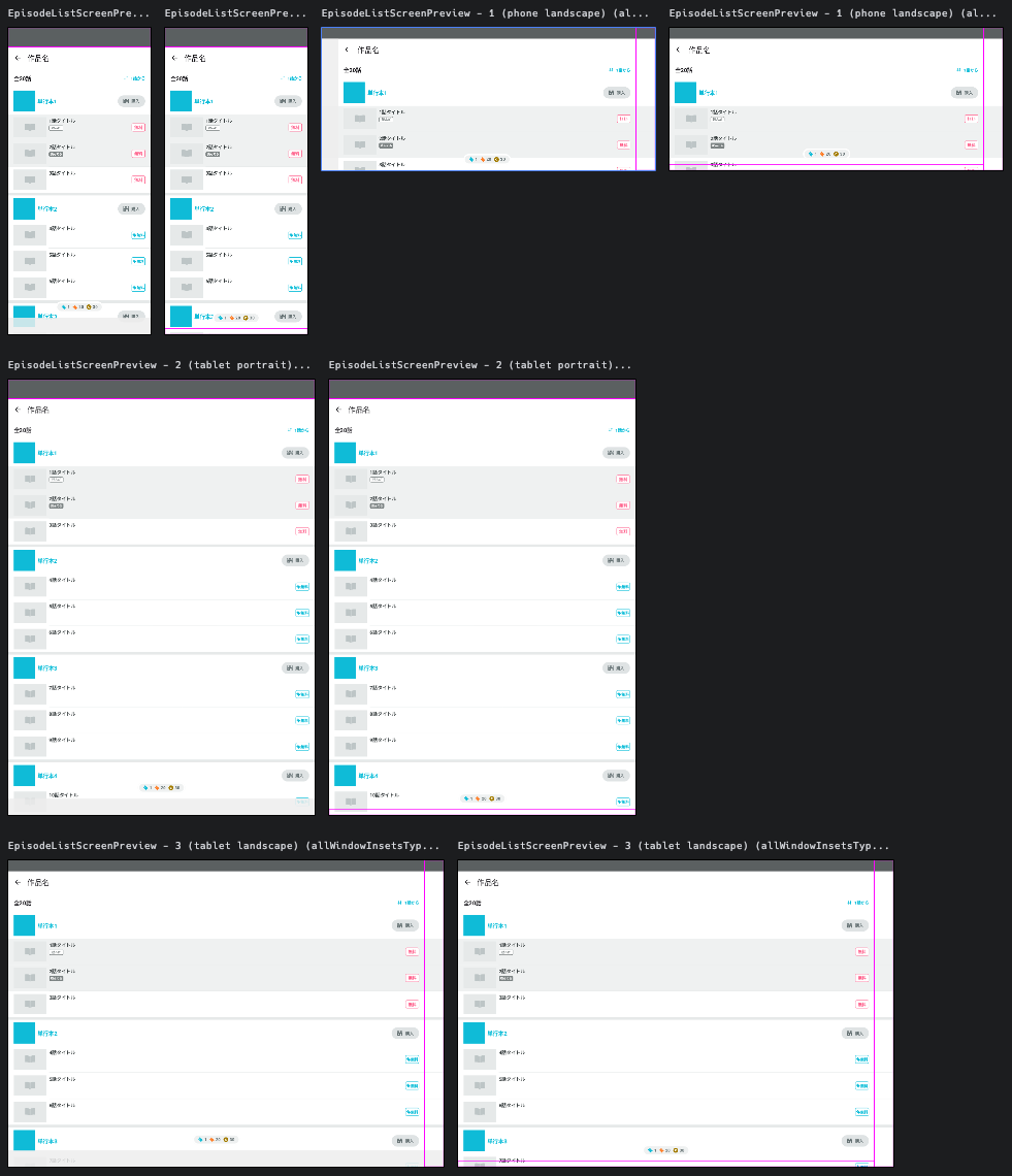
プレビューするデバイスの種類を増やす
さて、少し話が戻りますが、どうしてプレビューを活用したいのかというと、毎回いろんな機種で確認するのが大変だからです。
いろんな機種のプレビューを表示してみましょう。
他の画面でも同じ仕組みを使えるようにマルチプルプレビュー用のアノテーションを用意するといいでしょう。
+ @Preview(name = "0 (phone)", widthDp = 420, heightDp = 900)
+ @Preview(name = "1 (tablet)", widthDp = 900, heightDp = 1280)
+ annotation class ScreenPreview

- @Preview
+ @ScreenPreview
  @Composable
  private fun EpisodeListScreenPreview() {
      val windowInsets = WindowInsets(top = 56.dp, bottom = 48.dp)

      ScreenPreview(windowInsets) {
          EpisodeListScreen(
              windowInsets = windowInsets
          )
      }
  }

タブレットのプレビューも確認できるようになりました。
横持ちのプレビューを表示する
先程のマルチプルプレビューに横持ちを追加してみます。
  @Preview(name = "0 (phone portrait)", widthDp = 420, heightDp = 900)
+ @Preview(name = "1 (phone landscape)", widthDp = 900, heightDp = 420)
  @Preview(name = "2 (tablet portrait)", widthDp = 900, heightDp = 1280)
+ @Preview(name = "3 (tablet landscape)", widthDp = 1280, heightDp = 900)
  annotation class ScreenPreview
こうなります。
これは実機の表示とは違います。
実機では横持ちの場合ステータスバーがもう少し細いし、ナビゲーションバーは画面下部ではなく横に移動します。
横持ちのプレビューのときは横持ち用のWindowInsetsを使わなければなりません。
  @Composable
  fun ScreenPreview(
      windowInsets: WindowInsets,
      content: @Composable () -> Unit
  ) {
      Box {
          content()

          Box(
              modifier = Modifier
                  .align(Alignment.TopCenter)
                  .fillMaxWidth()
                  .windowInsetsTopHeight(windowInsets)
                  .background(statusBarBackgroundColor)
          )

+         if (LocalConfiguration.current.orientation == Configuration.ORIENTATION_LANDSCAPE) {
+             Box(
+                 modifier = Modifier
+                     .align(Alignment.CenterStart)
+                     .windowInsetsPadding(windowInsets.only(WindowInsetsSides.Top))
+                     .windowInsetsStartWidth(windowInsets)
+                     .fillMaxHeight()
+                     .background(navigationBarBackgroundColor)
+             )
+         } else {
              Box(
                  modifier = Modifier
                      .align(Alignment.BottomCenter)
                      .fillMaxWidth()
                      .windowInsetsBottomHeight(windowInsets)
                      .background(navigationBarBackgroundColor)
              )
+         }
      }
  }

  @Preview
  @Composable
  private fun EpisodeListScreenPreview() {
+     val windowInsets = if (LocalConfiguration.current.orientation == Configuration.ORIENTATION_PORTRAIT) {
          WindowInsets(top = 56.dp, bottom = 48.dp)
+     } else {
+         WindowInsets(left = 48.dp, top = 32.dp, right = 56.dp)
+     }

        ScreenPreview(windowInsets) {
          EpisodeListScreen(
              windowInsets = windowInsets
          )
      }
  }
いいですね。
WindowInsetsTypeを用意する
コードが複雑になってきました。
ステータスバー用のコード、ナビゲーションバー用のコード、インカメラ用のコードに分けると整理できそうです。
どの部分のWindowInsetsなのかを表すWindowInsetsTypeという型を用意してみます。
sealed class WindowInsetsType {
    @Composable
    abstract fun getWindowInsets(allWindowInsetsTypes: ImmutableSet<WindowInsetsType>): WindowInsets

    @Composable
    abstract fun Preview(allWindowInsetsTypes: ImmutableSet<WindowInsetsType>)

    protected val isPhone: Boolean
        @Composable
        get() {
            val configuration = LocalConfiguration.current
            val dpSize = DpSize(configuration.screenWidthDp.dp, configuration.screenHeightDp.dp)
            val windowSizeClass = WindowSizeClass.calculateFromSize(dpSize)
            return windowSizeClass.heightSizeClass < WindowHeightSizeClass.Expanded
        }

    protected val isLandscape: Boolean
        @Composable
        get() = LocalConfiguration.current.orientation == Configuration.ORIENTATION_LANDSCAPE

    data object StatusBar : WindowInsetsType() {
        @Composable
        override fun getWindowInsets(allWindowInsetsTypes: ImmutableSet<WindowInsetsType>): WindowInsets {
            val cameraWindowInsets = if (allWindowInsetsTypes.contains(Camera)) {
                Camera.getWindowInsets(allWindowInsetsTypes)
                    .only(WindowInsetsSides.Top)
            } else {
                WindowInsets(0)
            }

            return WindowInsets(top = 32.dp).union(cameraWindowInsets)
        }

        @Composable
        override fun Preview(allWindowInsetsTypes: ImmutableSet<WindowInsetsType>) {
            Box(Modifier.fillMaxSize()) {
                val statusBarWindowInsets = getWindowInsets(allWindowInsetsTypes)

                Box(
                    modifier = Modifier
                        .align(Alignment.TopCenter)
                        .fillMaxWidth()
                        .windowInsetsTopHeight(statusBarWindowInsets)
                        .background(statusBarBackgroundColor)
                )
            }
        }
    }

    data object NavigationBar : WindowInsetsType() {
        @Composable
        override fun getWindowInsets(allWindowInsetsTypes: ImmutableSet<WindowInsetsType>): WindowInsets {
            return if (isPhone && isLandscape) {
                WindowInsets(left = 48.dp)
            } else {
                WindowInsets(bottom = 48.dp)
            }
        }

        @Composable
        override fun Preview(allWindowInsetsTypes: ImmutableSet<WindowInsetsType>) {
            Box(Modifier.fillMaxSize()) {
                val navigationBarWindowInsets = getWindowInsets(allWindowInsetsTypes)

                val statusBarWindowInsets = if (allWindowInsetsTypes.contains(StatusBar)) {
                    StatusBar.getWindowInsets(allWindowInsetsTypes)
                } else {
                    WindowInsets(0)
                }

                if (isPhone && isLandscape) {
                    Box(
                        modifier = Modifier
                            .align(Alignment.CenterStart)
                            .windowInsetsPadding(statusBarWindowInsets.only(WindowInsetsSides.Vertical))
                            .windowInsetsStartWidth(navigationBarWindowInsets)
                            .fillMaxHeight()
                            .background(navigationBarBackgroundColor)
                    )
                } else {
                    Box(
                        modifier = Modifier
                            .align(Alignment.BottomCenter)
                            .windowInsetsPadding(statusBarWindowInsets.only(WindowInsetsSides.Horizontal))
                            .fillMaxWidth()
                            .windowInsetsBottomHeight(navigationBarWindowInsets)
                            .background(navigationBarBackgroundColor)
                    )
                }
            }
        }
    }

    data object Camera : WindowInsetsType() {
        @Composable
        override fun getWindowInsets(allWindowInsetsTypes: ImmutableSet<WindowInsetsType>): WindowInsets {
            return if (isLandscape) {
                WindowInsets(right = 56.dp)
            } else {
                WindowInsets(top = 56.dp)
            }
        }

        @Composable
        override fun Preview(allWindowInsetsTypes: ImmutableSet<WindowInsetsType>) {
        }
    }
}

@Composable
fun ScreenPreview(
    allWindowInsetsTypes: ImmutableSet<WindowInsetsType>,
    content: @Composable (WindowInsets) -> Unit
) {
    Box {
        val totalWindowInsets = allWindowInsetsTypes.fold(WindowInsets(0)) { acc, insetsType ->
            acc.union(insetsType.getWindowInsets(allWindowInsetsTypes))
        }

        content(totalWindowInsets)

        for (insetsType in allWindowInsetsTypes) {
            insetsType.Preview(
                allWindowInsetsTypes = allWindowInsetsTypes
            )
        }
    }
}

@ScreenPreview
@Composable
private fun EpisodeListScreenPreview() {
    val allWindowInsetsTypes = persistentSetOf(
        WindowInsetsType.StatusBar,
        WindowInsetsType.NavigationBar,
        WindowInsetsType.Camera,
    )

    ScreenPreview(allWindowInsetsTypes) { windowInsets ->
        EpisodeListScreen(
            windowInsets = windowInsets
        )
    }
}
コード量がかなり増えてしまいましたが、先ほどまでより意図がずっと正確に表せるようになりました。
次のステップ以降はさらに複雑になっていきますので、コード量が増えたとしてもこのような型を用意しておく方が可読性が高くなります。
WindowInsetsを半透明にする
作業中にミスが発生したときの気づきやすさはとても大事です。
こちらをご覧ください。
これは実装ミスが起きた場合のプレビューですが、あまりわかりやすくありません。
もともとこういうデザインだったと思い込み、見逃してしまうかもしれません。
作品名が表示されていないことに気づいても、誤って作品名の部分を削除してしまったようにも見えます。
ちなみにこちらは、画面上部の余白を設定し忘れた場合のプレビューでした。
ミスに気づきやすくするため、WindowInsetsを半透明にしましょう。
  data object StatusBar : WindowInsetsType() {
      @Composable
      override fun getWindowInsets(allWindowInsetsTypes: ImmutableSet<WindowInsetsType>): WindowInsets {
          ...
      }

      @Composable
      override fun Preview(allWindowInsetsTypes: ImmutableSet<WindowInsetsType>) {
          Box(Modifier.fillMaxSize()) {
              val statusBarWindowInsets = getWindowInsets(allWindowInsetsTypes)

+             val backgroundColor = statusBarBackgroundColor.copy(alpha = 0.8f)

              Box(
                  modifier = Modifier
                      .align(Alignment.TopCenter)
                      .fillMaxWidth()
                      .windowInsetsTopHeight(statusBarWindowInsets)
-                     .background(statusBarBackgroundColor)
+                     .background(backgroundColor)
              )
          }
      }
  }

  data object NavigationBar : WindowInsetsType() {
      @Composable
      override fun getWindowInsets(allWindowInsetsTypes: ImmutableSet<WindowInsetsType>): WindowInsets {
          return if (isPhone && isLandscape) {
              WindowInsets(left = 48.dp)
          } else {
              WindowInsets(bottom = 48.dp)
          }
      }

      @Composable
      override fun Preview(allWindowInsetsTypes: ImmutableSet<WindowInsetsType>) {
          Box(Modifier.fillMaxSize()) {
              val navigationBarWindowInsets = getWindowInsets(allWindowInsetsTypes)

              val statusBarWindowInsets = if (allWindowInsetsTypes.contains(StatusBar)) {
                  StatusBar.getWindowInsets(allWindowInsetsTypes)
              } else {
                  WindowInsets(0)
              }

+             // 白背景の上に表示するとき視認しやすいように少し黒に近づける
+             val backgroundColor = Color(
+                 red = navigationBarBackgroundColor.red * 0.94f,
+                 green = navigationBarBackgroundColor.green * 0.94f,
+                 blue = navigationBarBackgroundColor.blue * 0.94f,
+                 alpha = 0.85f,
+             )

              if (isPhone && isLandscape) {
                  Box(
                      modifier = Modifier
                          .align(Alignment.CenterStart)
                          .windowInsetsPadding(statusBarWindowInsets.only(WindowInsetsSides.Vertical))
                          .windowInsetsStartWidth(navigationBarWindowInsets)
                          .fillMaxHeight()
-                         .background(navigationBarBackgroundColor)
+                         .background(backgroundColor)
                  )
              } else {
                  Box(
                      modifier = Modifier
                          .align(Alignment.BottomCenter)
                          .windowInsetsPadding(statusBarWindowInsets.only(WindowInsetsSides.Horizontal))
                          .fillMaxWidth()
                          .windowInsetsBottomHeight(navigationBarWindowInsets)
-                         .background(navigationBarBackgroundColor)
+                         .background(backgroundColor)
                  )
              }
          }
      }
  }
ミスに気づきやすくなりましたね。
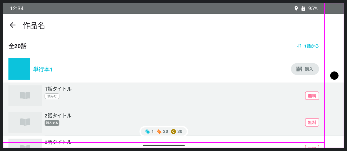
ジェスチャーナビゲーション
これまではナビゲーションバーに◁○□の3つのボタンがあるデバイスだけを想定していました。
しかしデバイスの設定によってはジェスチャーナビゲーションを利用できます。
ジェスチャーナビゲーションが有効なデバイスでは3ボタンは消滅し、代わりに細い線が配置されます。
ジェスチャーナビゲーションの場合のプレビューも見れるようにしたいですね。
これは少し工夫が必要です。
パルシィではジェスチャーナビゲーションが有効なデバイスではナビゲーションバーを透明にしているので、実際の表示に近づけると何も見えないのです。
試しに実際の表示に近づけてみたプレビューがこちらです。
一応、画面下部に細いWindowInsetsの余白が入っているのですが、ほとんどわかりません。
そこで、ジェスチャーナビゲーションの場合のナビゲーションバーには枠線を表示することにします。
  sealed class WindowInsetsType {
      @Composable
      abstract fun getWindowInsets(allWindowInsetsTypes: ImmutableSet<WindowInsetsType>): WindowInsets

      @Composable
      abstract fun Preview(allWindowInsetsTypes: ImmutableSet<WindowInsetsType>)

      protected val isPhone: Boolean
          @Composable
          get() {
              val configuration = LocalConfiguration.current
              val dpSize = DpSize(configuration.screenWidthDp.dp, configuration.screenHeightDp.dp)

              @OptIn(ExperimentalMaterial3WindowSizeClassApi::class)
              val windowSizeClass = WindowSizeClass.calculateFromSize(dpSize)
              return windowSizeClass.heightSizeClass < WindowHeightSizeClass.Expanded
          }

      protected val isLandscape: Boolean
          @Composable
          get() = LocalConfiguration.current.orientation == Configuration.ORIENTATION_LANDSCAPE

+     protected fun Modifier.drawBounds(): Modifier {
+         return drawBehind {
+             drawRect(Color.Magenta, style = Stroke(2.dp.toPx()))
+         }
+     }

      data object StatusBar : WindowInsetsType() {
          @Composable
          override fun getWindowInsets(allWindowInsetsTypes: ImmutableSet<WindowInsetsType>): WindowInsets {
              val cameraWindowInsets = if (allWindowInsetsTypes.contains(Camera)) {
                  Camera.getWindowInsets(allWindowInsetsTypes)
                      .only(WindowInsetsSides.Top)
              } else {
                  WindowInsets(0)
              }

              return WindowInsets(top = 32.dp).union(cameraWindowInsets)
          }

          @Composable
          override fun Preview(allWindowInsetsTypes: ImmutableSet<WindowInsetsType>) {
              Box(Modifier.fillMaxSize()) {
                  val statusBarWindowInsets = getWindowInsets(allWindowInsetsTypes)

                  val backgroundColor = statusBarBackgroundColor.copy(alpha = 0.8f)

                  Box(
                      modifier = Modifier
                          .align(Alignment.TopCenter)
                          .fillMaxWidth()
                          .windowInsetsTopHeight(statusBarWindowInsets)
                          .background(backgroundColor)
                  )
              }
          }
      }

      data object ButtonNavigationBar : WindowInsetsType() {
          @Composable
          override fun getWindowInsets(allWindowInsetsTypes: ImmutableSet<WindowInsetsType>): WindowInsets {
              return if (isPhone && isLandscape) {
                  WindowInsets(left = 48.dp)
              } else {
                  WindowInsets(bottom = 48.dp)
              }
          }

          @Composable
          override fun Preview(allWindowInsetsTypes: ImmutableSet<WindowInsetsType>) {
              Box(Modifier.fillMaxSize()) {
                  val navigationBarWindowInsets = getWindowInsets(allWindowInsetsTypes)

                  val statusBarWindowInsets = if (allWindowInsetsTypes.contains(StatusBar)) {
                      StatusBar.getWindowInsets(allWindowInsetsTypes)
                  } else {
                      WindowInsets(0)
                  }

                  // 白背景の上に表示するとき視認しやすいように少し黒に近づける
                  val backgroundColor = Color(
                      red = navigationBarBackgroundColor.red * 0.94f,
                      green = navigationBarBackgroundColor.green * 0.94f,
                      blue = navigationBarBackgroundColor.blue * 0.94f,
                      alpha = 0.85f,
                  )

                  if (isPhone && isLandscape) {
                      Box(
                          modifier = Modifier
                              .align(Alignment.CenterStart)
                              .windowInsetsPadding(statusBarWindowInsets.only(WindowInsetsSides.Vertical))
                              .windowInsetsStartWidth(navigationBarWindowInsets)
                              .fillMaxHeight()
                              .background(backgroundColor)
                      )
                  } else {
                      Box(
                          modifier = Modifier
                              .align(Alignment.BottomCenter)
                              .windowInsetsPadding(statusBarWindowInsets.only(WindowInsetsSides.Horizontal))
                              .fillMaxWidth()
                              .windowInsetsBottomHeight(navigationBarWindowInsets)
                              .background(backgroundColor)
                      )
                  }
              }
          }
      }

+     data object GestureNavigationBar : WindowInsetsType() {
+         @Composable
+         override fun getWindowInsets(allWindowInsetsTypes: ImmutableSet<WindowInsetsType>): WindowInsets {
+             return WindowInsets(bottom = 16.dp)
+         }
+
+         @Composable
+         override fun Preview(allWindowInsetsTypes: ImmutableSet<WindowInsetsType>) {
+             Box(Modifier.fillMaxSize()) {
+                 val navigationBarWindowInsets = getWindowInsets(allWindowInsetsTypes)
+
+                 val statusBarWindowInsets = if (allWindowInsetsTypes.contains(StatusBar)) {
+                     StatusBar.getWindowInsets(allWindowInsetsTypes)
+                 } else {
+                     WindowInsets(0)
+                 }
+
+                 val cameraWindowInsets = if (allWindowInsetsTypes.contains(Camera)) {
+                     Camera.getWindowInsets(allWindowInsetsTypes)
+                 } else {
+                     WindowInsets(0)
+                 }
+
+                 Box(
+                     modifier = Modifier
+                         .align(Alignment.BottomCenter)
+                         .windowInsetsPadding(
+                             statusBarWindowInsets
+                                 .union(cameraWindowInsets)
+                                 .only(WindowInsetsSides.Horizontal)
+                         )
+                         .fillMaxWidth()
+                         .windowInsetsBottomHeight(navigationBarWindowInsets)
+                         .drawBounds()
+                 )
+             }
+         }
+     }

      data object Camera : WindowInsetsType() {
          @Composable
          override fun getWindowInsets(allWindowInsetsTypes: ImmutableSet<WindowInsetsType>): WindowInsets {
              return if (isLandscape) {
                  WindowInsets(right = 56.dp)
              } else {
                  WindowInsets(top = 56.dp)
              }
          }

          @Composable
          override fun Preview(allWindowInsetsTypes: ImmutableSet<WindowInsetsType>) {
+             Box(Modifier.fillMaxSize()) {
+                 val cameraWindowInsets = getWindowInsets(allWindowInsetsTypes)
+
+                 if (isLandscape) {
+                     Box(
+                         modifier = Modifier
+                             .align(Alignment.CenterEnd)
+                             .windowInsetsEndWidth(cameraWindowInsets)
+                             .fillMaxHeight()
+                             .drawBounds()
+                     )
+                 } else {
+                     Box(
+                         modifier = Modifier
+                             .align(Alignment.TopCenter)
+                             .fillMaxWidth()
+                             .windowInsetsTopHeight(cameraWindowInsets)
+                             .drawBounds()
+                     )
+                 }
+             }
          }
      }
  }

  @ScreenPreview
  @Composable
  private fun EpisodeListScreenButtonNavigationPreview() {
      val allWindowInsetsTypes = persistentSetOf(
          WindowInsetsType.StatusBar,
          WindowInsetsType.ButtonNavigationBar,
          WindowInsetsType.Camera,
      )

      ScreenPreview(allWindowInsetsTypes) { windowInsets ->
          EpisodeListScreen(
              windowInsets = windowInsets
          )
      }
  }

+ @ScreenPreview
+ @Composable
+ private fun EpisodeListScreenGestureNavigationPreview() {
+     val allWindowInsetsTypes = persistentSetOf(
+         WindowInsetsType.StatusBar,
+         WindowInsetsType.GestureNavigationBar,
+         WindowInsetsType.Camera,
+     )
+
+     ScreenPreview(allWindowInsetsTypes) { windowInsets ->
+         EpisodeListScreen(
+             windowInsets = windowInsets
+         )
+     }
+ }

ついでにインカメラの領域にも枠線をつけてみました。
PreviewParameterProviderを活用する
先程の変更により、3ボタンナビゲーションの場合のプレビューとジェスチャーナビゲーションの場合の2つのプレビューを書かなければいけなくなりました。
なんとか1回書くだけで2種類のナビゲーションバーを出力できないでしょうか?
PreviewParameterProviderが使えます。
+ class WindowInsetsTypesProvider : CollectionPreviewParameterProvider<ImmutableSet<WindowInsetsType>>(
+     persistentListOf(
+         persistentSetOf(
+             WindowInsetsType.StatusBar,
+             WindowInsetsType.ButtonNavigationBar,
+             WindowInsetsType.Camera,
+         ),
+         persistentSetOf(
+             WindowInsetsType.StatusBar,
+             WindowInsetsType.GestureNavigationBar,
+             WindowInsetsType.Camera,
+         ),
+     )
+ )

+ @ScreenPreview
+ @Composable
+ private fun EpisodeListScreenPreview(
+     @PreviewParameter(WindowInsetsTypesProvider::class)
+     allWindowInsetsTypes: ImmutableSet<WindowInsetsType>
+ ) {
+     ScreenPreview(allWindowInsetsTypes) { windowInsets ->
+         EpisodeListScreen(
+             windowInsets = windowInsets
+         )
+     }
+ }
- @ScreenPreview
- @Composable
- private fun EpisodeListScreenButtonNavigationPreview() {
-     val allWindowInsetsTypes = persistentSetOf(
-         WindowInsetsType.StatusBar,
-         WindowInsetsType.ButtonNavigationBar,
-         WindowInsetsType.Camera,
-     )
-
-     ScreenPreview(allWindowInsetsTypes) { windowInsets ->
-         EpisodeListScreen(
-             windowInsets = windowInsets
-         )
-     }
- }
-
- @ScreenPreview
- @Composable
- private fun EpisodeListScreenGestureNavigationPreview() {
-     val allWindowInsetsTypes = persistentSetOf(
-         WindowInsetsType.StatusBar,
-         WindowInsetsType.GestureNavigationBar,
-         WindowInsetsType.Camera,
-     )
-
-     ScreenPreview(allWindowInsetsTypes) { windowInsets ->
-         EpisodeListScreen(
-             windowInsets = windowInsets
-         )
-     }
- }
(スマホ or タブレット) × (縦持ち or 横持ち) × (3ボタンナビゲーション or ジェスチャーナビゲーション) の8パターンのプレビューが1つのプレビューコードで生成できるようになりました。
これまでプレビューのためにたくさんのコードを書いてきましたが、各画面ごとに書かなければならないコードはこれだけなのです。
@ScreenPreview
@Composable
private fun EpisodeListScreenPreview(
    @PreviewParameter(WindowInsetsTypesProvider::class)
    allWindowInsetsTypes: ImmutableSet<WindowInsetsType>
) {
    ScreenPreview(allWindowInsetsTypes) { windowInsets ->
        EpisodeListScreen(
            windowInsets = windowInsets
        )
    }
}
WindowInsetsの認知負荷を下げる
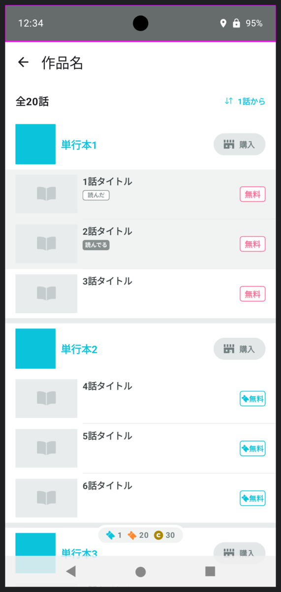
ここまでですでにかなり見やすいプレビューになっているのですが、最後にダメ押しでさらにWindowInsetsに装飾を施していきます。
data object StatusBar : WindowInsetsType() {
@Composable
override fun Preview(allWindowInsetsTypes: ImmutableSet<WindowInsetsType>) {
Box(Modifier.fillMaxSize()) {
val statusBarWindowInsets = getWindowInsets(allWindowInsetsTypes)
+ val contentWindowInsets = allWindowInsetsTypes
+ .filter { it !is StatusBar }
+ .map { it.getWindowInsets(allWindowInsetsTypes) }
+ .fold(WindowInsets(0), WindowInsets::union)
val backgroundColor = statusBarBackgroundColor.copy(alpha = 0.8f)
Row(
modifier = Modifier
.align(Alignment.TopCenter)
.fillMaxWidth()
.windowInsetsTopHeight(statusBarWindowInsets)
.background(backgroundColor)
+ .windowInsetsPadding(contentWindowInsets.only(WindowInsetsSides.Horizontal))
+ .padding(horizontal = 16.dp)
) {
+ CompositionLocalProvider(LocalContentColor provides Color.White) {
+ Text(
+ text = "12:34",
+ fontSize = 15.sp,
+ modifier = Modifier
+ .align(Alignment.CenterVertically)
+ .padding(horizontal = 4.dp)
+ )
+
+ Spacer(Modifier.weight(1f))
+
+ Icon(
+ imageVector = Icons.Default.LocationOn,
+ contentDescription = null,
+ modifier = Modifier
+ .align(Alignment.CenterVertically)
+ .padding(2.dp)
+ .size(16.dp)
+ )
+
+ Icon(
+ imageVector = Icons.Default.Lock,
+ contentDescription = null,
+ modifier = Modifier
+ .align(Alignment.CenterVertically)
+ .padding(2.dp)
+ .size(16.dp)
+ )
+
+ Text(
+ text = "95%",
+ fontSize = 14.sp,
+ modifier = Modifier
+ .align(Alignment.CenterVertically)
+ .padding(horizontal = 4.dp)
+ )
+ }
}
}
}
}
data object ButtonNavigationBar : WindowInsetsType() {
+ private inline fun imageVector(
+ width: Dp,
+ height: Dp,
+ buildBlock: ImageVector.Builder.() -> Unit,
+ ): ImageVector {
+ return ImageVector
+ .Builder(
+ defaultWidth = width,
+ defaultHeight = height,
+ viewportWidth = width.value,
+ viewportHeight = height.value,
+ )
+ .apply(buildBlock)
+ .build()
+ }
+
+ private val backButtonIcon = imageVector(32.dp, 32.dp) {
+ materialPath {
+ moveTo(23f, 7f)
+ verticalLineToRelative(18f)
+ lineToRelative(-15f, -9f)
+ close()
+ }
+ }
+
+ private val homeButtonIcon = imageVector(32.dp, 32.dp) {
+ materialPath {
+ moveTo(24f, 17f)
+ arcToRelative(8f, 8f, 0f, isMoreThanHalf = false, isPositiveArc = true, -8f, 8f)
+ arcToRelative(8f, 8f, 0f, isMoreThanHalf = false, isPositiveArc = true, -8f, -8f)
+ arcToRelative(8f, 8f, 0f, isMoreThanHalf = false, isPositiveArc = true, 8f, -8f)
+ arcToRelative(8f, 8f, 0f, isMoreThanHalf = false, isPositiveArc = true, 8f, 8f)
+ close()
+ }
+ }
+
+ private val taskButtonIcon = imageVector(32.dp, 32.dp) {
+ materialPath {
+ moveTo(8.5f, 8.5f)
+ horizontalLineToRelative(15f)
+ verticalLineToRelative(15f)
+ horizontalLineToRelative(-15f)
+ close()
+ }
+ }
@Composable
override fun Preview(allWindowInsetsTypes: ImmutableSet<WindowInsetsType>) {
Box(Modifier.fillMaxSize()) {
val navigationBarWindowInsets = getWindowInsets(allWindowInsetsTypes)
val statusBarWindowInsets = if (allWindowInsetsTypes.contains(StatusBar)) {
StatusBar.getWindowInsets(allWindowInsetsTypes)
} else {
WindowInsets(0)
}
+ val contentWindowInsets = allWindowInsetsTypes
+ .filter { it !is ButtonNavigationBar }
+ .map { it.getWindowInsets(allWindowInsetsTypes) }
+ .fold(WindowInsets(0), WindowInsets::union)
// 白背景の上に表示するとき視認しやすいように少し黒に近づける
val backgroundColor = Color(
red = navigationBarBackgroundColor.red * 0.94f,
green = navigationBarBackgroundColor.green * 0.94f,
blue = navigationBarBackgroundColor.blue * 0.94f,
alpha = 0.85f,
)
if (isPhone && isLandscape) {
Box(
+ contentAlignment = Alignment.Center,
modifier = Modifier
.align(Alignment.CenterStart)
.windowInsetsPadding(statusBarWindowInsets.only(WindowInsetsSides.Vertical))
.windowInsetsStartWidth(navigationBarWindowInsets)
.fillMaxHeight()
.background(backgroundColor)
+ .windowInsetsPadding(
+ contentWindowInsets
+ .exclude(statusBarWindowInsets)
+ .only(WindowInsetsSides.Vertical)
+ )
) {
+ Column(
+ verticalArrangement = Arrangement.SpaceEvenly,
+ horizontalAlignment = Alignment.CenterHorizontally,
+ modifier = Modifier
+ .heightIn(max = 400.dp)
+ .fillMaxSize()
+ ) {
+ CompositionLocalProvider(LocalContentColor provides Color.Gray) {
+ Icon(
+ imageVector = backButtonIcon,
+ contentDescription = null,
+ )
+
+ Icon(
+ imageVector = homeButtonIcon,
+ contentDescription = null,
+ )
+
+ Icon(
+ imageVector = taskButtonIcon,
+ contentDescription = null,
+ )
+ }
+ }
}
} else {
Box(
+ contentAlignment = Alignment.Center,
modifier = Modifier
.align(Alignment.BottomCenter)
.windowInsetsPadding(statusBarWindowInsets.only(WindowInsetsSides.Horizontal))
.fillMaxWidth()
.windowInsetsBottomHeight(navigationBarWindowInsets)
.background(backgroundColor)
+ .windowInsetsPadding(
+ contentWindowInsets
+ .exclude(statusBarWindowInsets)
+ .only(WindowInsetsSides.Horizontal)
+ )
) {
+ Row(
+ horizontalArrangement = Arrangement.SpaceEvenly,
+ verticalAlignment = Alignment.CenterVertically,
+ modifier = Modifier
+ .widthIn(max = 400.dp)
+ .fillMaxSize()
+ ) {
+ CompositionLocalProvider(LocalContentColor provides Color.Gray) {
+ Icon(
+ imageVector = backButtonIcon,
+ contentDescription = null,
+ )
+
+ Icon(
+ imageVector = homeButtonIcon,
+ contentDescription = null,
+ )
+
+ Icon(
+ imageVector = taskButtonIcon,
+ contentDescription = null,
+ )
+ }
+ }
}
}
}
}
}
data object GestureNavigationBar : WindowInsetsType() {
@Composable
override fun Preview(allWindowInsetsTypes: ImmutableSet<WindowInsetsType>) {
Box(Modifier.fillMaxSize()) {
val navigationBarWindowInsets = getWindowInsets(allWindowInsetsTypes)
val statusBarWindowInsets = if (allWindowInsetsTypes.contains(StatusBar)) {
StatusBar.getWindowInsets(allWindowInsetsTypes)
} else {
WindowInsets(0)
}
val cameraWindowInsets = if (allWindowInsetsTypes.contains(Camera)) {
Camera.getWindowInsets(allWindowInsetsTypes)
} else {
WindowInsets(0)
}
+ val contentWindowInsets = allWindowInsetsTypes
+ .filter { it !is ButtonNavigationBar }
+ .map { it.getWindowInsets(allWindowInsetsTypes) }
+ .fold(WindowInsets(0), WindowInsets::union)
Box(
contentAlignment = Alignment.Center,
modifier = Modifier
.align(Alignment.BottomCenter)
.windowInsetsPadding(
statusBarWindowInsets
.union(cameraWindowInsets)
.only(WindowInsetsSides.Horizontal)
)
.fillMaxWidth()
.windowInsetsBottomHeight(navigationBarWindowInsets)
.drawBounds()
+ .windowInsetsPadding(
+ contentWindowInsets
+ .exclude(
+ statusBarWindowInsets.union(cameraWindowInsets)
+ )
+ .only(WindowInsetsSides.Horizontal)
+ )
) {
+ Box(
+ modifier = Modifier
+ .widthIn(max = 120.dp)
+ .fillMaxWidth()
+ .height(4.dp)
+ .background(Color.DarkGray, RoundedCornerShape(percent = 50))
+ )
}
}
}
}
data object Camera : WindowInsetsType() {
@Composable
override fun Preview(allWindowInsetsTypes: ImmutableSet<WindowInsetsType>) {
Box(Modifier.fillMaxSize()) {
val cameraWindowInsets = getWindowInsets(allWindowInsetsTypes)
if (isLandscape) {
Box(
+ contentAlignment = Alignment.Center,
modifier = Modifier
.align(Alignment.CenterEnd)
.windowInsetsEndWidth(cameraWindowInsets)
.fillMaxHeight()
.drawBounds()
) {
+ Box(
+ modifier = Modifier
+ .size(24.dp)
+ .background(Color.Black, CircleShape)
+ )
}
} else {
Box(
+ contentAlignment = Alignment.Center,
modifier = Modifier
.align(Alignment.TopCenter)
.fillMaxWidth()
.windowInsetsTopHeight(cameraWindowInsets)
.drawBounds()
) {
+ Box(
+ modifier = Modifier
+ .size(24.dp)
+ .background(Color.Black, CircleShape)
+ )
}
}
}
}
}
どうでしょう?
適当な文字やアイコンが並んでいるだけでもグッと本物のステータスバーっぽくなりますし、黒い丸を置くだけでひと目でインカメラだとわかるようになります。
完成!
長かったですね。
ほとんど実機と同じ見た目ですが、WindowInsetsの確認という点においては実機をも超えたのではないかと思います。
勘の良い方はお気づきになったかもしれませんが、この記事で貼った画面のスクリーンショットはすべてプレビューで生成したものでした。
終わりに
パルシィ部ではこの記事の前半部分で紹介した対応方針を決め、後半で紹介したプレビューでの開発環境を整えてから、快適に作業が進められており、すでに多くの画面がEdge-to-Edgeで描画されています。
WindowInsetsを設定する作業は大変ですが、アプリをよりよくするチャンスだと考えて前向きに取り組んでいます。
みなさんも、今までより少しだけ世界を広げてみませんか?
そして、その際にこの記事の内容が少しでもお役に立てばうれしいです。


